Summary
Revamping the setup flow spiked a new feature’s adoption by 30.91%
Context
To stay competitive and respond to growing merchant requests, ReferralCandy introduced a new feature called “FlexiTiers”. It allows merchants to give customers different rewards depending on the number of friends they referred.
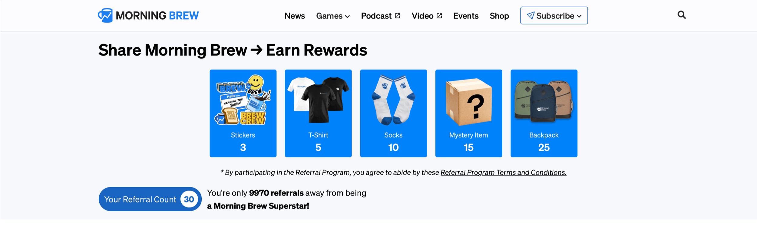
For example, the popular newsletter Morning Brew has a referral program with multiple tiers:
Refer 3rd friend —> get a free stickers
Refer 5th friend —> get a free t-shirt
Refer 10th friend —> get free socks
Refer 15th friend —> get a mystery item
Refer 25th friend —> get a free backpack
Problem
After launching the feature, merchants using a single reward setup were abruptly changed to the new "Flexi-Tiers" setup without warning.

More serious though, was that merchants who did want to use tiers misunderstood the interface.
Nothing in the UI communicated that to put a cap to their rewards, they needed to create a final tier that gave customers "nothing."
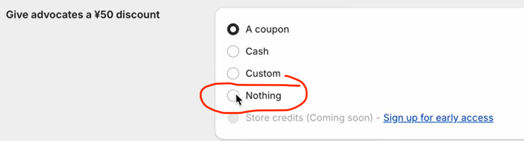
Without a "nothing" tier, a customer could earn unlimited rewards (such as unlimited $50 off coupons), risking profit loss.
To resolve this quickly, support staff had to quickly reach out to merchants to double check their rewards.
Solution
We made several backend and frontend improvements to increase feature adoption, including:
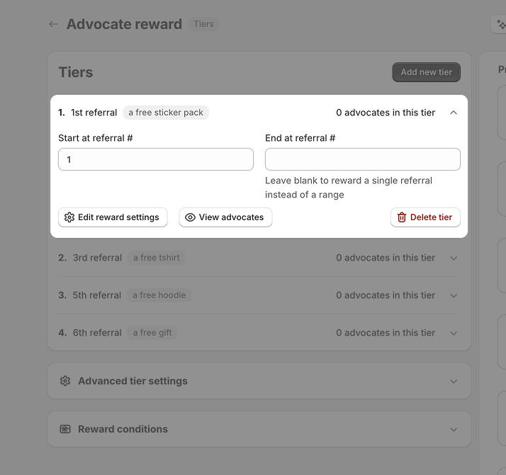
✔️ Showing a clear preview on the settings page
Users didn’t need to wonder if they set up their tiers correctly.

✔️ Using informative banners and success toasts to guide user
When users switched from a single reward to multi-reward setup and vice versa, they were informed.

✔️ Simplifying the flow of using tiers
Instead of needing to create a "tier that gives customers “nothing”, users could follow their mental model and simply create tiers based on what they wanted to give out, such as a free t-shirt for 3 referrals.
✔️ Progressive disclosure kept things simple
Several complex settings were nested in accordion components. This allowed users to focus on high-level actions and only view details when needed.
✔️ Users are in the driver's seat
Instead of forcing all users to adopt tiers, those who wanted to keep a simple single-reward setup could do so.
Clear buttons for editing a single reward vs adding new tiers gave the power back to users.
Furthermore, we were able to help the marketing team sell better by listing several creative ways the new “FlexiTiers” feature could be used.
Impact
The redesign resulted in an 30.91% adoption spike and the following feedback:
“Love it! ❤️”
- 🧚🏼♀️ C, key account manager
“This layout is much easier to see. So when I was editing it before, it was quite difficult to see. So this is fine.”
- 🧙🏻♂️ B, growth marketing lead